# Install required packages if not already installed
if (!require("tidyverse")) install.packages("tidyverse")
if (!require("ggthemes")) install.packages("ggthemes")
if (!require("scales")) install.packages("scales")
if (!require("patchwork")) install.packages("patchwork")
if (!require("modelsummary")) install.packages("modelsummary")
if (!require("kableExtra")) install.packages("kableExtra")
if (!require("palmerpenguins")) install.packages("palmerpenguins")
if (!require("gapminder")) install.packages("gapminder")2 📊 Statistical Computing & Data Visualization 📄
2.1 Learning Objectives
By the end of this chapter, you will be able to:
- Understand the principles of effective data visualization
- Create various types of plots using ggplot2
- Customize and enhance visualizations for business presentations
- Generate statistical summaries using modelsummary
- Create publication-quality tables for reports
- Combine visualizations into dashboards and reports
- Apply best practices for data visualization in business contexts
2.2 Prerequisites
For this chapter, you’ll need:
- R and RStudio installed on your computer
- Understanding of data manipulation with dplyr (covered in Chapter 1)
- The following R packages installed:
# Load required packages
library(tidyverse)      # For data manipulation and visualization
library(ggthemes)       # For additional ggplot themes
library(scales)         # For formatting scales
library(patchwork)      # For combining plots
library(modelsummary)   # For creating tables of model results
library(kableExtra)     # For enhancing tables
library(palmerpenguins) # For the penguins dataset
library(gapminder)      # For the gapminder dataset
2.3 Introduction to Data Visualization
Data visualization is the graphical representation of information and data. It helps us understand patterns, trends, and relationships in data that might not be apparent from raw numbers.
Why Visualization Matters in Business
Effective data visualization is crucial in business analytics for several reasons:
- Communication: Visualizations make complex data accessible to stakeholders with varying technical backgrounds.
- Pattern Recognition: Humans are better at identifying patterns visually than by looking at raw numbers.
- Decision Making: Well-designed visualizations can facilitate faster and more informed business decisions.
- Storytelling: Visualizations help tell a compelling story with data, making insights more memorable.
- Exploration: Visualizations allow analysts to explore data interactively and discover unexpected insights.
Principles of Effective Data Visualization
When creating visualizations, keep these principles in mind:
- Clarity: The visualization should clearly communicate the intended message.
- Simplicity: Avoid unnecessary complexity or “chart junk” that distracts from the data.
- Accuracy: The visualization should accurately represent the data without distortion.
- Context: Provide sufficient context for proper interpretation.
- Accessibility: Use color schemes and design elements that are accessible to all users.
2.4 Introduction to ggplot2
ggplot2 is a powerful and flexible package for creating data visualizations in R. It’s based on the Grammar of Graphics, a systematic approach to describing and building graphs.
The Grammar of Graphics
The Grammar of Graphics breaks down visualizations into components:
- Data: The dataset being visualized
- Aesthetics: Mapping of variables to visual properties (position, color, size, etc.)
- Geometries: The visual elements used to represent data (points, lines, bars, etc.)
- Facets: Splitting the plot into multiple panels
- Statistics: Statistical transformations applied to the data
- Coordinates: The coordinate system used
- Themes: Visual styling of the plot
Basic ggplot2 Syntax
The basic structure of a ggplot2 plot is:
ggplot(data = <DATA>) +
  <GEOM_FUNCTION>(mapping = aes(<MAPPINGS>), stat = <STAT>, position = <POSITION>) +
  <COORDINATE_FUNCTION> +
  <FACET_FUNCTION> +
  <SCALE_FUNCTION> +
  <THEME_FUNCTION>
Let’s start with a simple example using the built-in mpg dataset:
# Basic scatterplot
ggplot(data = mpg) +
  geom_point(mapping = aes(x = displ, y = hwy))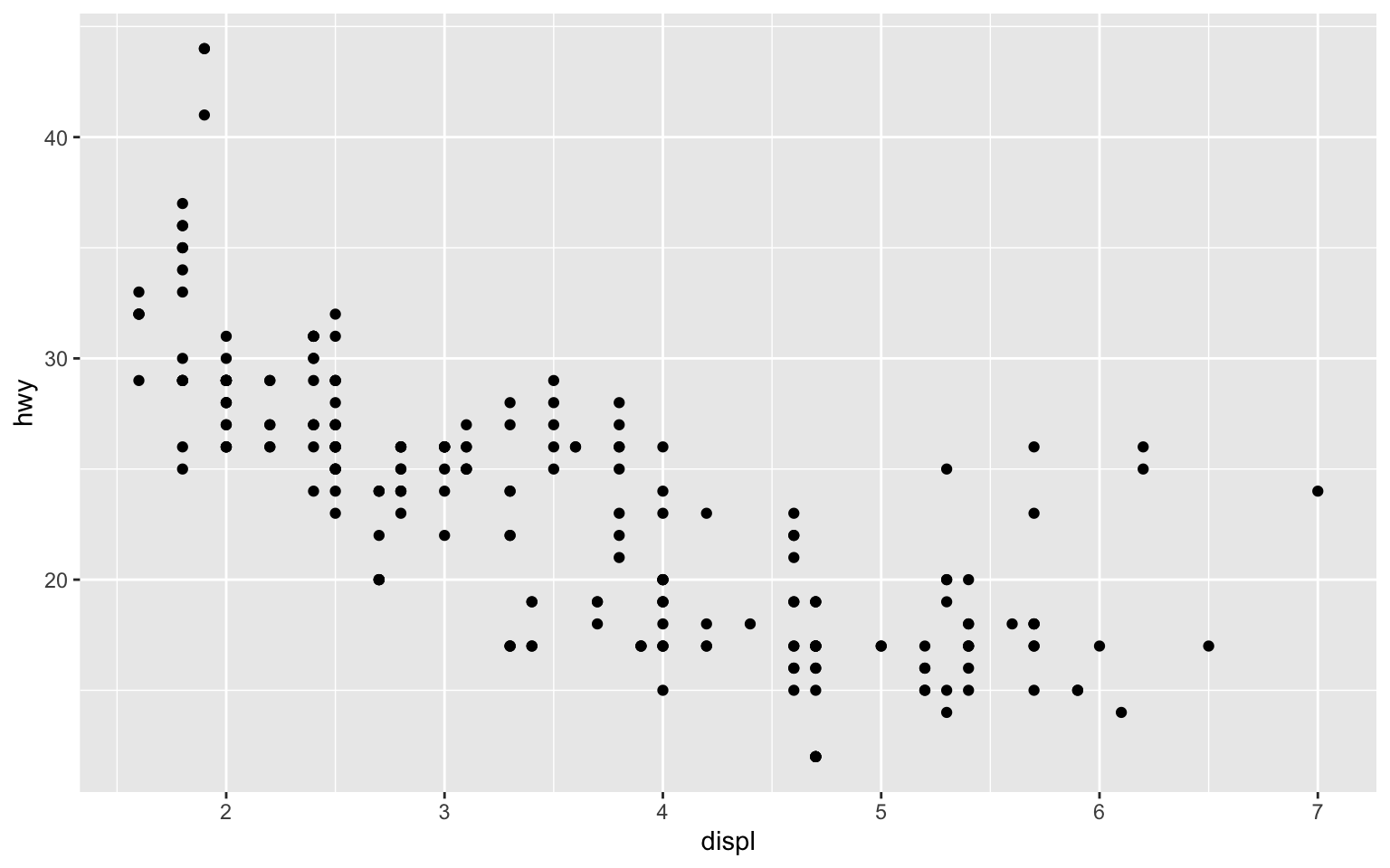
Adding Aesthetics
We can map variables to additional aesthetics like color, size, and shape:
# Scatterplot with color
ggplot(data = mpg) +
  geom_point(mapping = aes(x = displ, y = hwy, color = class))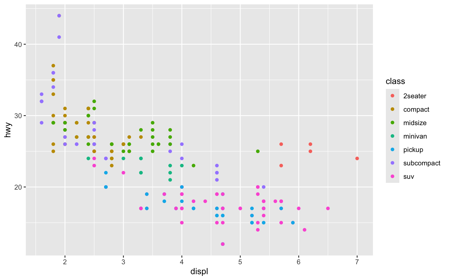
# Scatterplot with multiple aesthetics
ggplot(data = mpg) +
  geom_point(mapping = aes(x = displ, y = hwy, color = class, size = cyl, alpha = 0.7))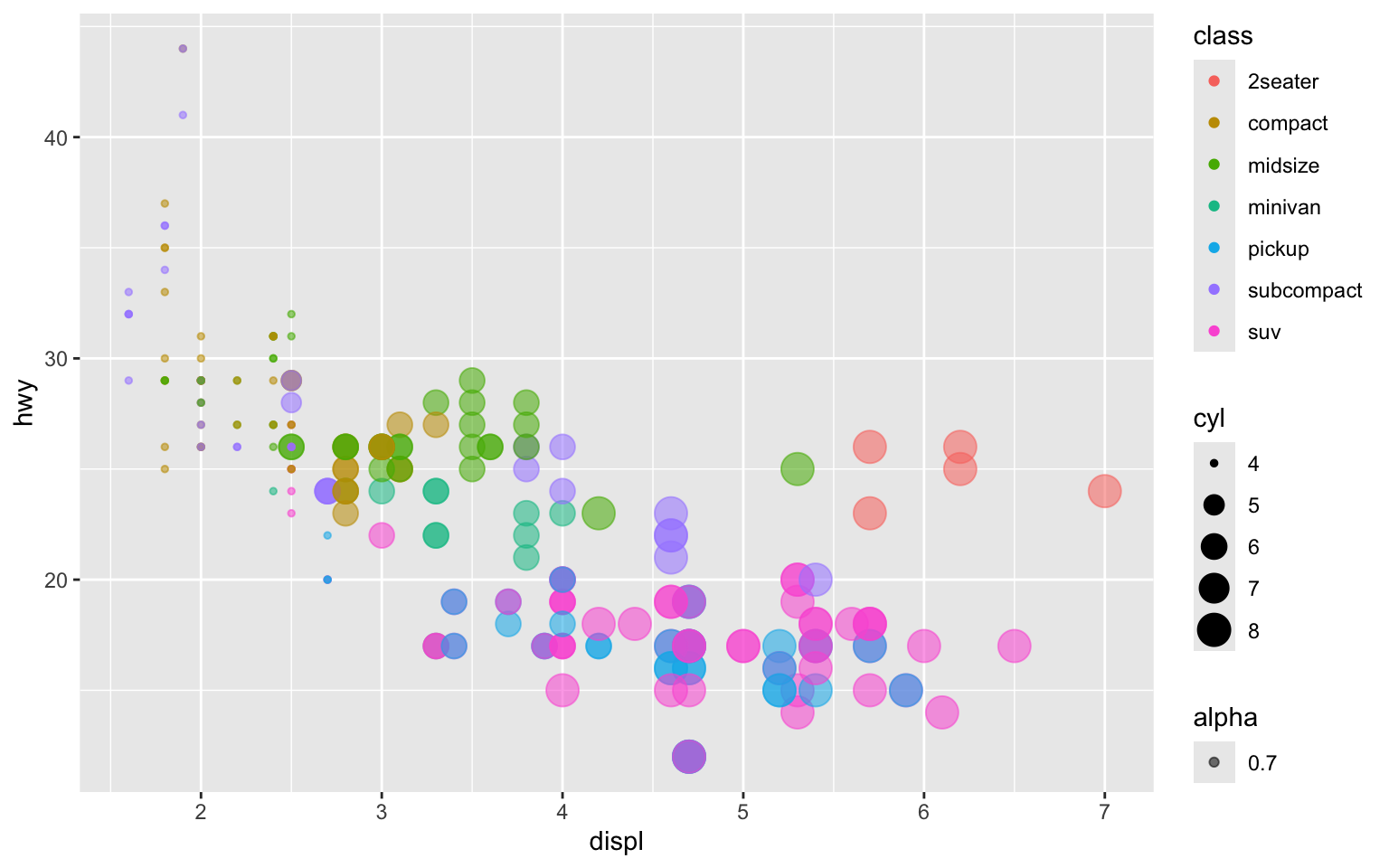
Setting vs. Mapping Aesthetics
There’s a difference between setting an aesthetic (applying it to all points) and mapping an aesthetic (varying it based on a variable):
# Setting color (all points are blue)
ggplot(data = mpg) +
  geom_point(mapping = aes(x = displ, y = hwy), color = "blue")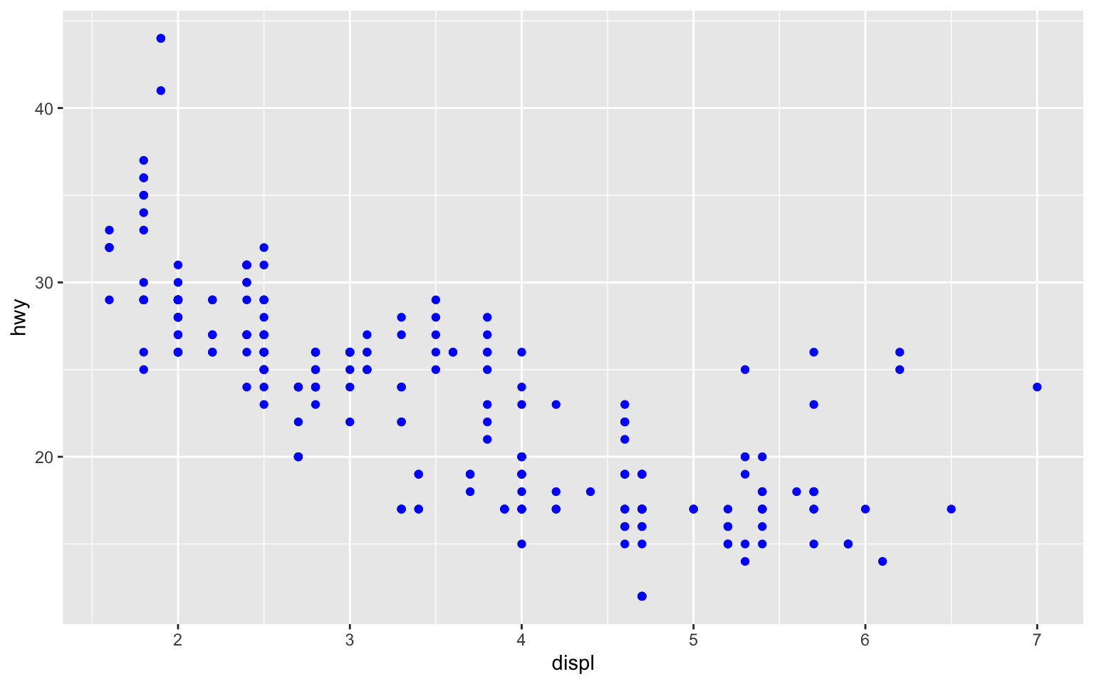
# Mapping color (color varies by class)
ggplot(data = mpg) +
  geom_point(mapping = aes(x = displ, y = hwy, color = class))
2.5 Common Plot Types for Business Analytics
Let’s explore various plot types that are useful for business analytics.
Scatterplots
Scatterplots show the relationship between two continuous variables:
# Load the penguins dataset
data(penguins)

# Basic scatterplot
ggplot(data = penguins, aes(x = bill_length_mm, y = bill_depth_mm)) +
  geom_point() +
  labs(
    title = "Penguin Bill Dimensions",
    subtitle = "Relationship between bill length and depth",
    x = "Bill Length (mm)",
    y = "Bill Depth (mm)"
  )
Warning: Removed 2 rows containing missing values or values outside the scale range
(`geom_point()`).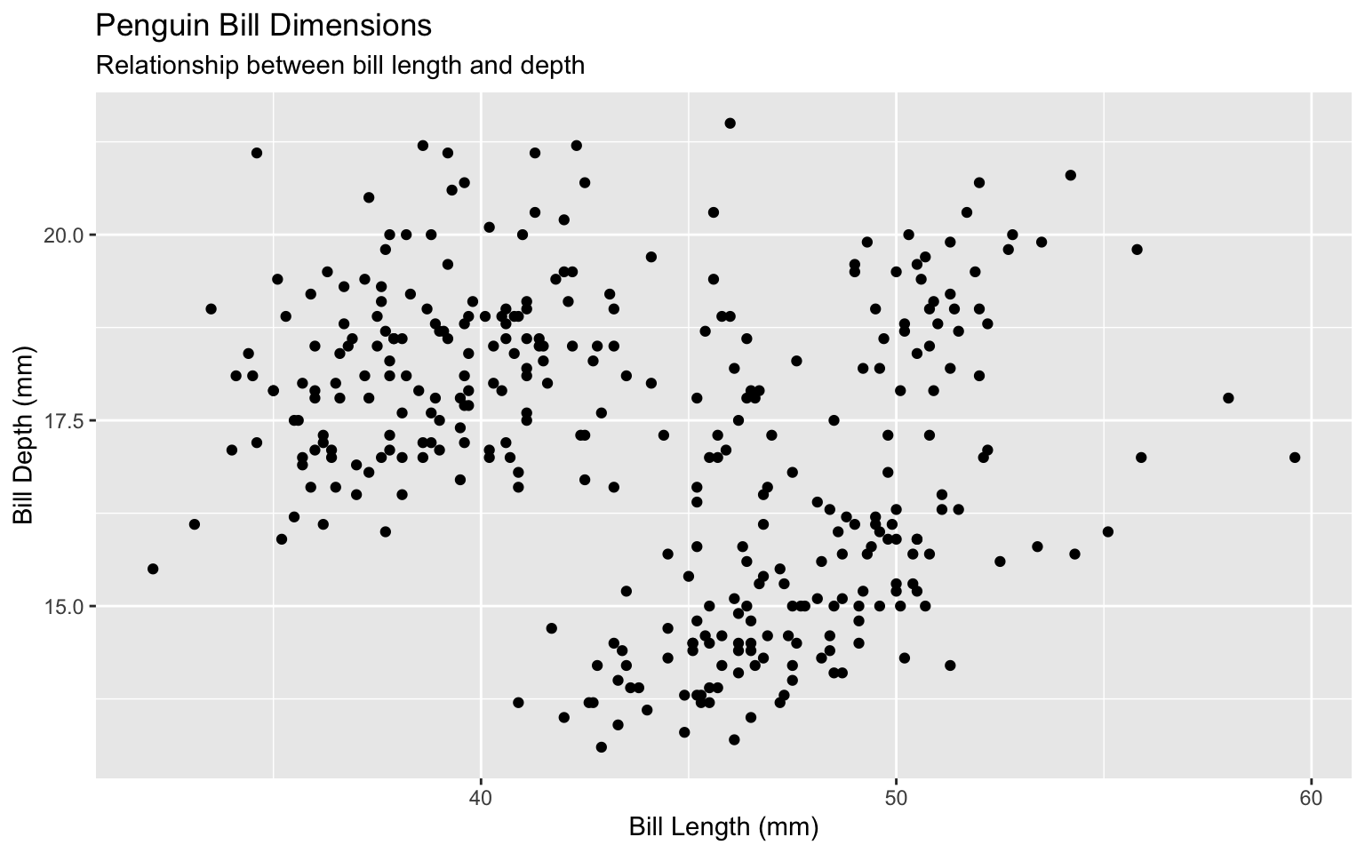
# Scatterplot with color and shape
ggplot(data = penguins, aes(x = bill_length_mm, y = bill_depth_mm, color = species, shape = species)) +
  geom_point(size = 3, alpha = 0.8) +
  labs(
    title = "Penguin Bill Dimensions by Species",
    x = "Bill Length (mm)",
    y = "Bill Depth (mm)",
    color = "Species",
    shape = "Species"
  ) +
  theme_minimal()
Warning: Removed 2 rows containing missing values or values outside the scale range
(`geom_point()`).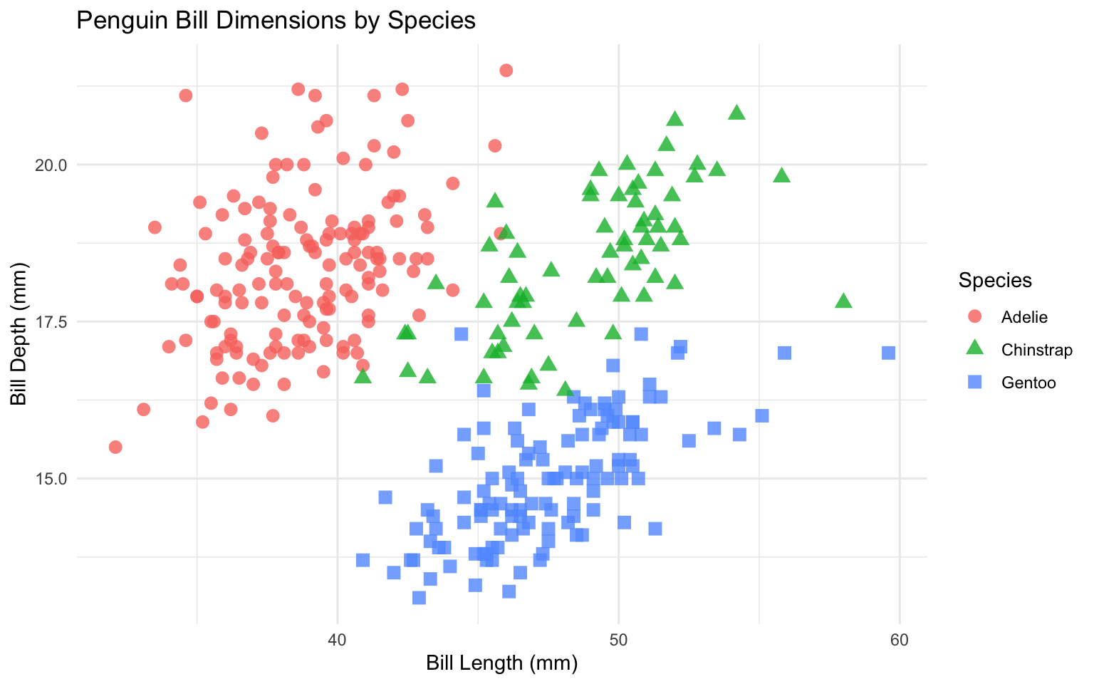
Line Charts
Line charts are useful for showing trends over time:
# Load the economics dataset
data(economics)

# Basic line chart
ggplot(data = economics, aes(x = date, y = unemploy)) +
  geom_line() +
  labs(
    title = "US Unemployment",
    subtitle = "1967-2015",
    x = NULL,
    y = "Unemployment (thousands)"
  ) +
  theme_minimal()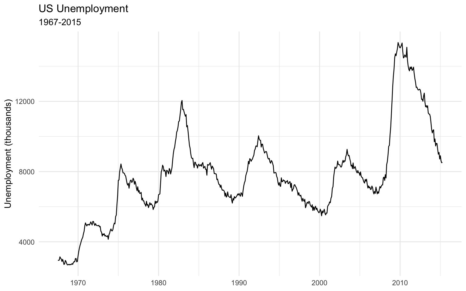
# Multiple line chart
economics_long <- economics %>%
  select(date, unemploy, uempmed) %>%
  pivot_longer(cols = c(unemploy, uempmed), names_to = "variable", values_to = "value")

ggplot(data = economics_long, aes(x = date, y = value, color = variable)) +
  geom_line() +
  labs(
    title = "US Unemployment Metrics",
    subtitle = "1967-2015",
    x = NULL,
    y = "Value",
    color = "Metric"
  ) +
  scale_color_manual(
    values = c("unemploy" = "steelblue", "uempmed" = "darkred"),
    labels = c("unemploy" = "Unemployment (thousands)", "uempmed" = "Median Duration (weeks)")
  ) +
  theme_minimal()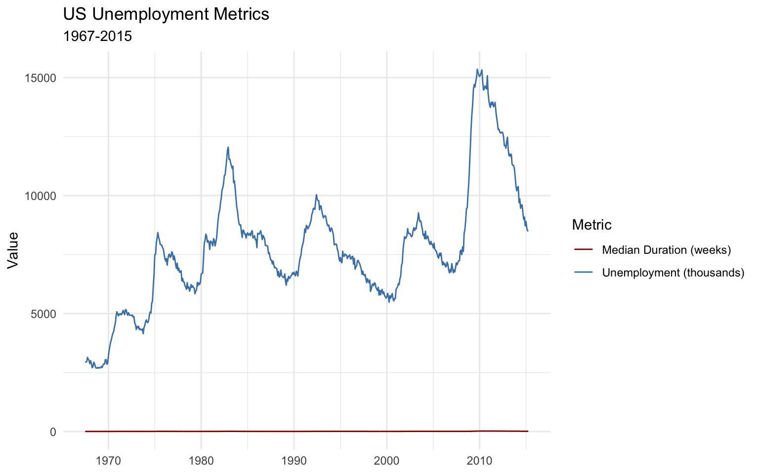
Bar Charts
Bar charts are ideal for comparing categorical data:
# Count of cars by class
mpg_count <- mpg %>%
  count(class) %>%
  mutate(class = fct_reorder(class, n))

# Basic bar chart
ggplot(data = mpg_count, aes(x = class, y = n)) +
  geom_col() +
  labs(
    title = "Number of Cars by Class",
    x = NULL,
    y = "Count"
  ) +
  theme_minimal()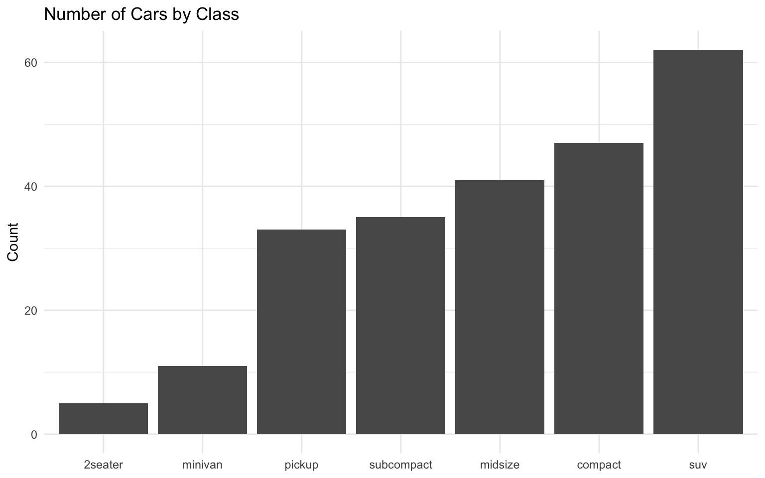
# Horizontal bar chart with sorted categories
ggplot(data = mpg_count, aes(x = n, y = class)) +
  geom_col(fill = "steelblue") +
  labs(
    title = "Number of Cars by Class",
    x = "Count",
    y = NULL
  ) +
  theme_minimal()
Grouped and Stacked Bar Charts
For comparing multiple categories:
# Prepare data for grouped bar chart
mpg_summary <- mpg %>%
  group_by(class, drv) %>%
  summarize(
    count = n(),
    .groups = "drop"
  ) %>%
  filter(count > 0)

# Grouped bar chart
ggplot(data = mpg_summary, aes(x = class, y = count, fill = drv)) +
  geom_col(position = "dodge") +
  labs(
    title = "Number of Cars by Class and Drive Type",
    x = NULL,
    y = "Count",
    fill = "Drive Type"
  ) +
  scale_fill_brewer(palette = "Set2") +
  theme_minimal() +
  theme(axis.text.x = element_text(angle = 45, hjust = 1))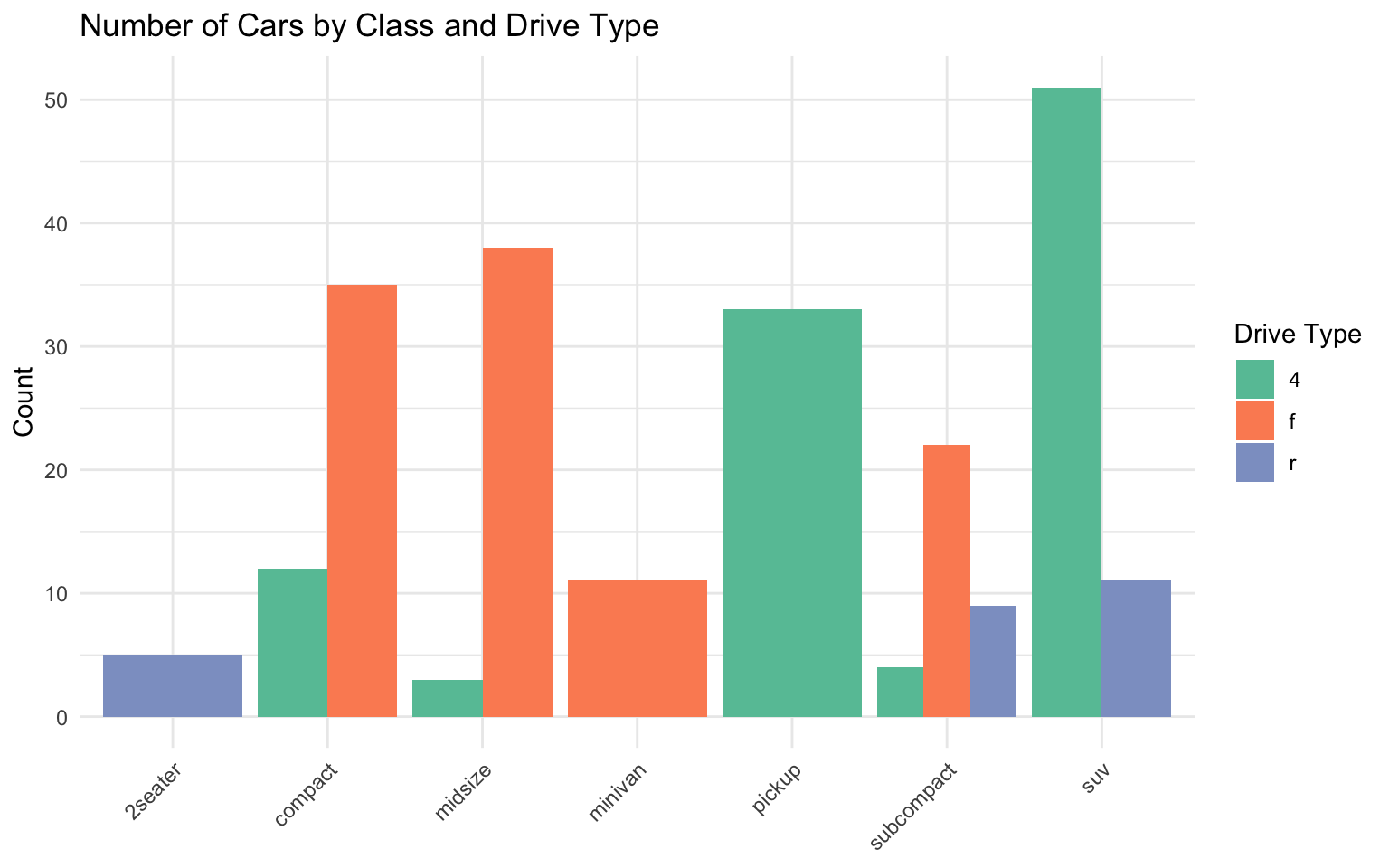
# Stacked bar chart
ggplot(data = mpg_summary, aes(x = class, y = count, fill = drv)) +
  geom_col() +
  labs(
    title = "Number of Cars by Class and Drive Type",
    x = NULL,
    y = "Count",
    fill = "Drive Type"
  ) +
  scale_fill_brewer(palette = "Set2") +
  theme_minimal() +
  theme(axis.text.x = element_text(angle = 45, hjust = 1))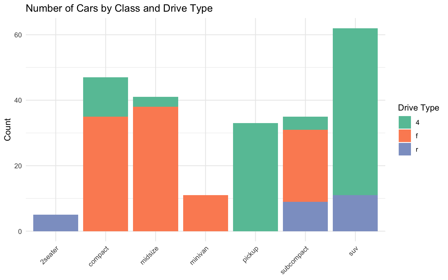
# 100% stacked bar chart
ggplot(data = mpg_summary, aes(x = class, y = count, fill = drv)) +
  geom_col(position = "fill") +
  labs(
    title = "Proportion of Drive Types by Class",
    x = NULL,
    y = "Proportion",
    fill = "Drive Type"
  ) +
  scale_fill_brewer(palette = "Set2") +
  scale_y_continuous(labels = percent) +
  theme_minimal() +
  theme(axis.text.x = element_text(angle = 45, hjust = 1))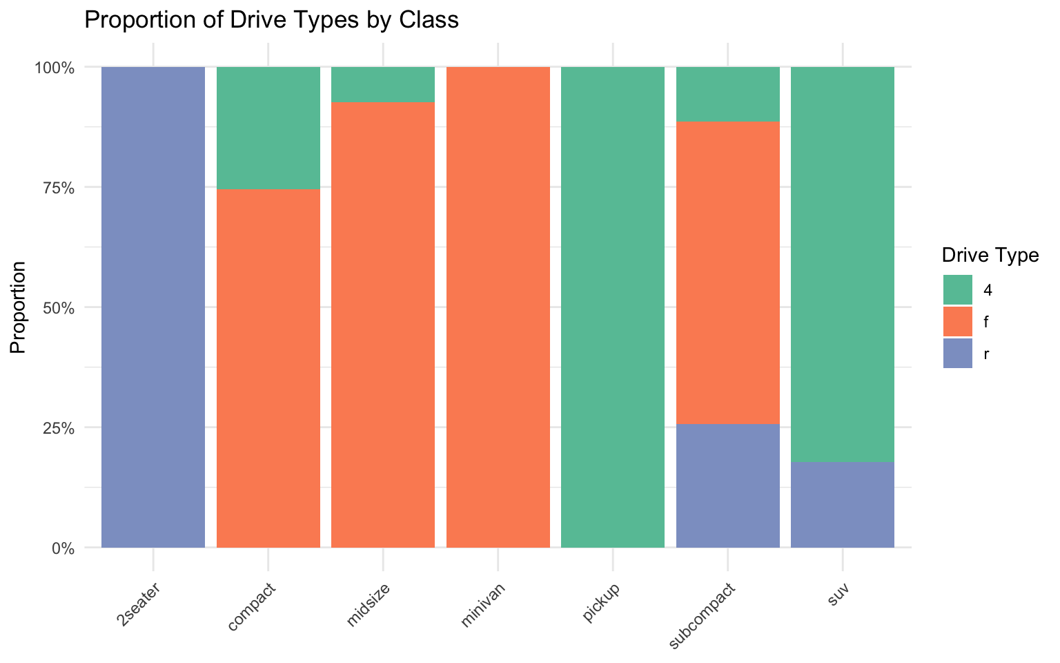
Histograms and Density Plots
For visualizing distributions:
# Histogram
ggplot(data = penguins, aes(x = body_mass_g)) +
  geom_histogram(bins = 30, fill = "steelblue", color = "white") +
  labs(
    title = "Distribution of Penguin Body Mass",
    x = "Body Mass (g)",
    y = "Count"
  ) +
  theme_minimal()
Warning: Removed 2 rows containing non-finite outside the scale range
(`stat_bin()`).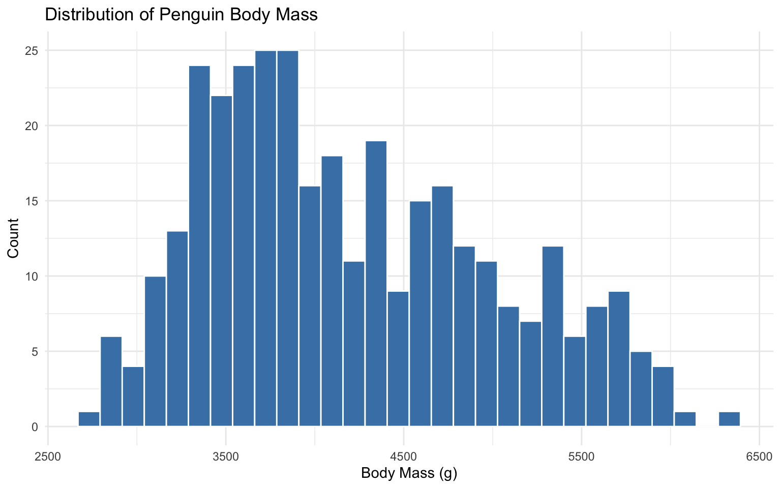
# Density plot
ggplot(data = penguins, aes(x = body_mass_g)) +
  geom_density(fill = "steelblue", alpha = 0.5) +
  labs(
    title = "Distribution of Penguin Body Mass",
    x = "Body Mass (g)",
    y = "Density"
  ) +
  theme_minimal()
Warning: Removed 2 rows containing non-finite outside the scale range
(`stat_density()`).
# Histogram with density overlay
ggplot(data = penguins, aes(x = body_mass_g)) +
  geom_histogram(aes(y = ..density..), bins = 30, fill = "steelblue", color = "white", alpha = 0.5) +
  geom_density(color = "darkred", size = 1) +
  labs(
    title = "Distribution of Penguin Body Mass",
    x = "Body Mass (g)",
    y = "Density"
  ) +
  theme_minimal()
Warning: Using `size` aesthetic for lines was deprecated in ggplot2 3.4.0.
ℹ Please use `linewidth` instead.Warning: The dot-dot notation (`..density..`) was deprecated in ggplot2 3.4.0.
ℹ Please use `after_stat(density)` instead.Warning: Removed 2 rows containing non-finite outside the scale range
(`stat_bin()`).Warning: Removed 2 rows containing non-finite outside the scale range
(`stat_density()`).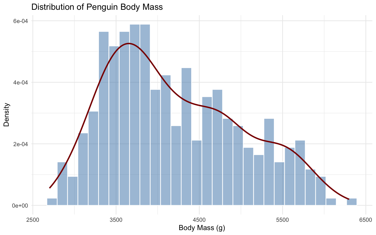
# Density plots by group
ggplot(data = penguins, aes(x = body_mass_g, fill = species)) +
  geom_density(alpha = 0.5) +
  labs(
    title = "Distribution of Penguin Body Mass by Species",
    x = "Body Mass (g)",
    y = "Density",
    fill = "Species"
  ) +
  scale_fill_brewer(palette = "Set2") +
  theme_minimal()
Warning: Removed 2 rows containing non-finite outside the scale range
(`stat_density()`).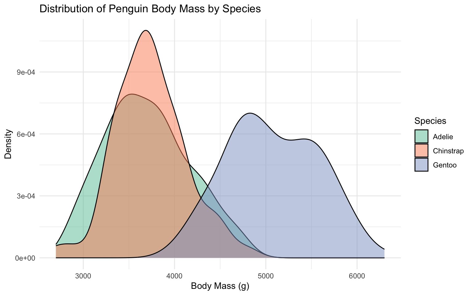
Box Plots and Violin Plots
For comparing distributions across categories:
# Box plot
ggplot(data = penguins, aes(x = species, y = body_mass_g)) +
  geom_boxplot() +
  labs(
    title = "Penguin Body Mass by Species",
    x = NULL,
    y = "Body Mass (g)"
  ) +
  theme_minimal()
Warning: Removed 2 rows containing non-finite outside the scale range
(`stat_boxplot()`).
# Box plot with points
ggplot(data = penguins, aes(x = species, y = body_mass_g)) +
  geom_boxplot() +
  geom_jitter(width = 0.2, alpha = 0.5, color = "steelblue") +
  labs(
    title = "Penguin Body Mass by Species",
    x = NULL,
    y = "Body Mass (g)"
  ) +
  theme_minimal()
Warning: Removed 2 rows containing non-finite outside the scale range
(`stat_boxplot()`).Warning: Removed 2 rows containing missing values or values outside the scale range
(`geom_point()`).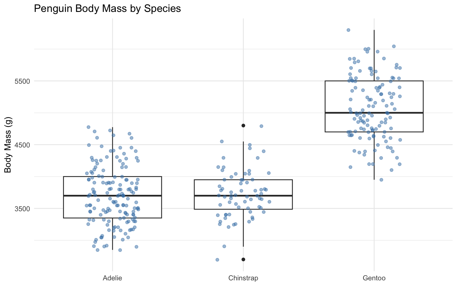
# Violin plot
ggplot(data = penguins, aes(x = species, y = body_mass_g)) +
  geom_violin() +
  labs(
    title = "Penguin Body Mass by Species",
    x = NULL,
    y = "Body Mass (g)"
  ) +
  theme_minimal()
Warning: Removed 2 rows containing non-finite outside the scale range
(`stat_ydensity()`).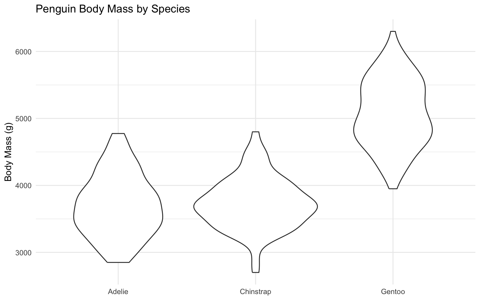
# Violin plot with box plot overlay
ggplot(data = penguins, aes(x = species, y = body_mass_g)) +
  geom_violin(aes(fill = species), alpha = 0.5) +
  geom_boxplot(width = 0.1, fill = "white") +
  labs(
    title = "Penguin Body Mass by Species",
    x = NULL,
    y = "Body Mass (g)",
    fill = "Species"
  ) +
  scale_fill_brewer(palette = "Set2") +
  theme_minimal() +
  theme(legend.position = "none")
Warning: Removed 2 rows containing non-finite outside the scale range
(`stat_ydensity()`).Warning: Removed 2 rows containing non-finite outside the scale range
(`stat_boxplot()`).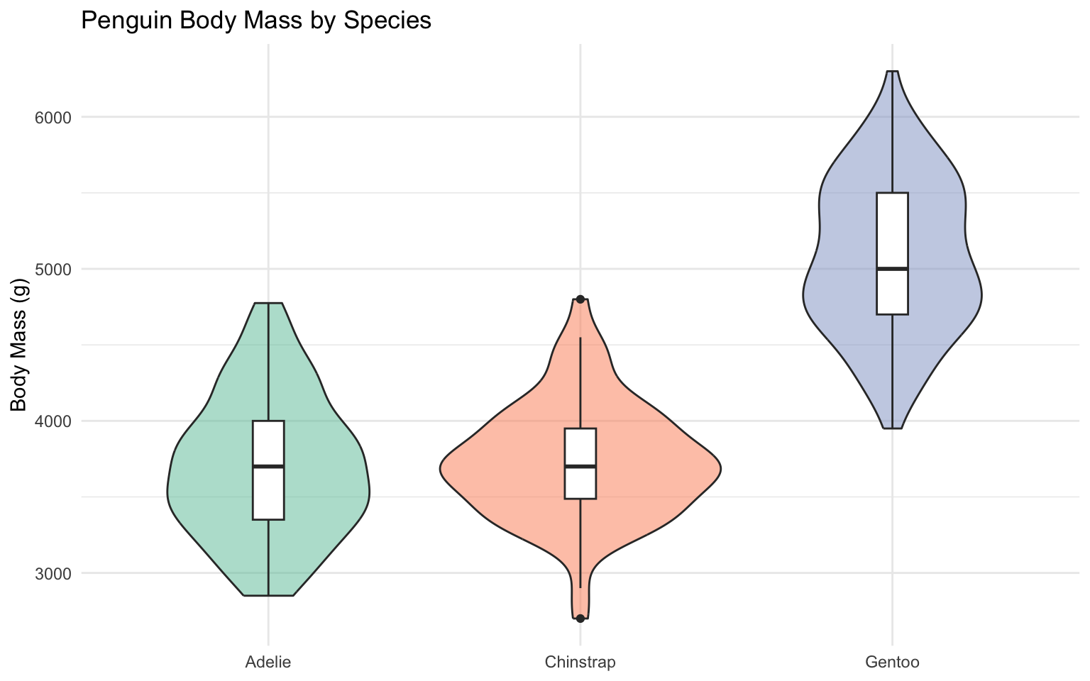
Heatmaps
For visualizing relationships between variables:
# Create a correlation matrix
penguins_numeric <- penguins %>%
  select(bill_length_mm, bill_depth_mm, flipper_length_mm, body_mass_g) %>%
  drop_na()

cor_matrix <- cor(penguins_numeric)
cor_data <- as.data.frame(as.table(cor_matrix))
names(cor_data) <- c("Var1", "Var2", "Correlation")

# Heatmap
ggplot(data = cor_data, aes(x = Var1, y = Var2, fill = Correlation)) +
  geom_tile() +
  scale_fill_gradient2(low = "blue", mid = "white", high = "red", midpoint = 0) +
  labs(
    title = "Correlation Matrix of Penguin Measurements",
    x = NULL,
    y = NULL
  ) +
  theme_minimal() +
  theme(axis.text.x = element_text(angle = 45, hjust = 1))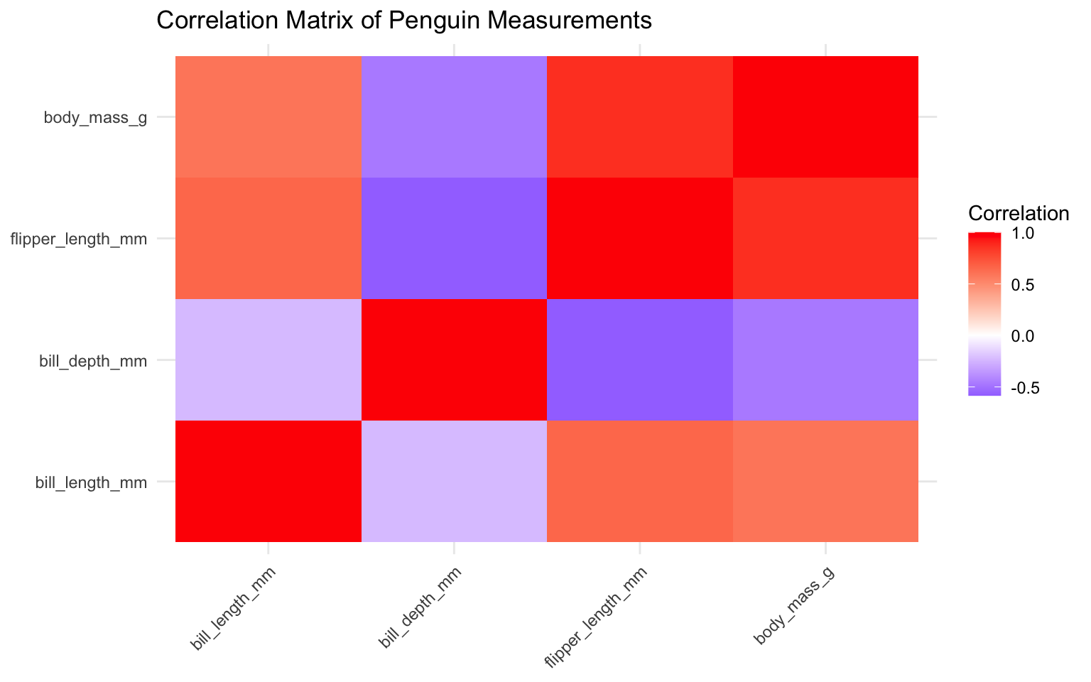
Faceting
Faceting allows you to create small multiples of the same plot for different subsets of the data:
# Facet by species
ggplot(data = penguins, aes(x = bill_length_mm, y = bill_depth_mm)) +
  geom_point(aes(color = species), size = 3, alpha = 0.8) +
  facet_wrap(~ species) +
  labs(
    title = "Penguin Bill Dimensions by Species",
    x = "Bill Length (mm)",
    y = "Bill Depth (mm)",
    color = "Species"
  ) +
  theme_minimal() +
  theme(legend.position = "bottom")
Warning: Removed 2 rows containing missing values or values outside the scale range
(`geom_point()`).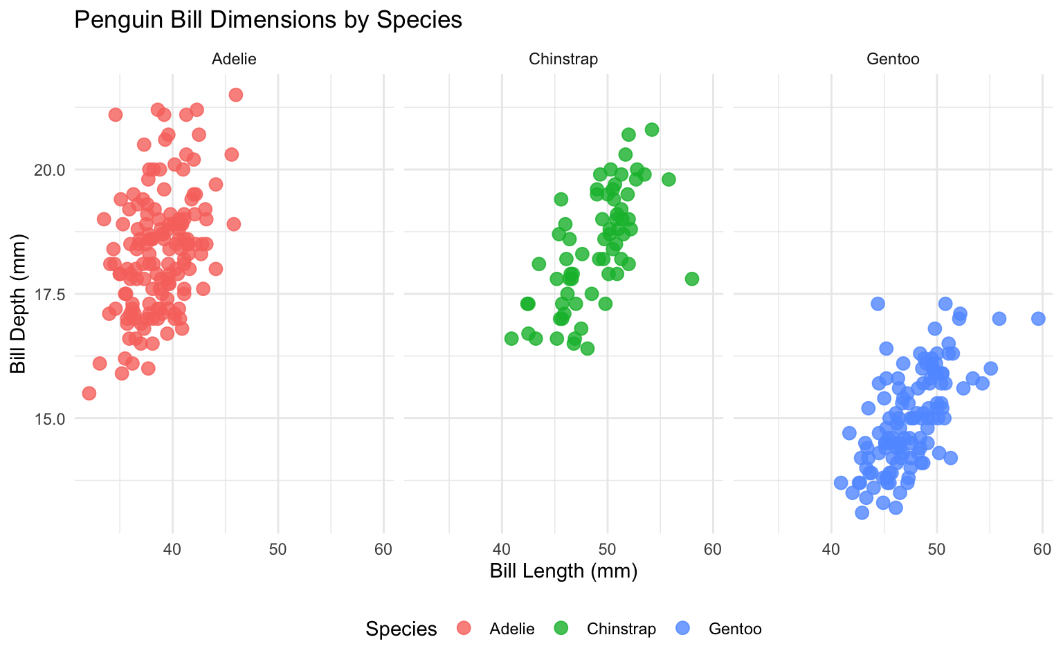
# Facet by two variables
ggplot(data = penguins, aes(x = bill_length_mm, y = bill_depth_mm)) +
  geom_point(aes(color = sex), size = 3, alpha = 0.8) +
  facet_grid(species ~ island) +
  labs(
    title = "Penguin Bill Dimensions by Species and Island",
    x = "Bill Length (mm)",
    y = "Bill Depth (mm)",
    color = "Sex"
  ) +
  theme_minimal() +
  theme(legend.position = "bottom")
Warning: Removed 2 rows containing missing values or values outside the scale range
(`geom_point()`).
2.6 Customizing ggplot2 Visualizations
Let’s explore how to customize ggplot2 visualizations for business presentations.
Titles, Subtitles, and Captions
# Add titles, subtitles, and captions
ggplot(data = penguins, aes(x = bill_length_mm, y = bill_depth_mm, color = species)) +
  geom_point(size = 3, alpha = 0.8) +
  labs(
    title = "Penguin Bill Dimensions by Species",
    subtitle = "Relationship between bill length and depth for three penguin species",
    caption = "Data source: Palmer Penguins package",
    x = "Bill Length (mm)",
    y = "Bill Depth (mm)",
    color = "Species"
  ) +
  theme_minimal()
Warning: Removed 2 rows containing missing values or values outside the scale range
(`geom_point()`).
Scales
Scales control how data values are mapped to visual properties:
# Customize color scale
ggplot(data = penguins, aes(x = bill_length_mm, y = bill_depth_mm, color = species)) +
  geom_point(size = 3, alpha = 0.8) +
  labs(
    title = "Penguin Bill Dimensions by Species",
    x = "Bill Length (mm)",
    y = "Bill Depth (mm)",
    color = "Species"
  ) +
  scale_color_brewer(palette = "Set1") +
  theme_minimal()
Warning: Removed 2 rows containing missing values or values outside the scale range
(`geom_point()`).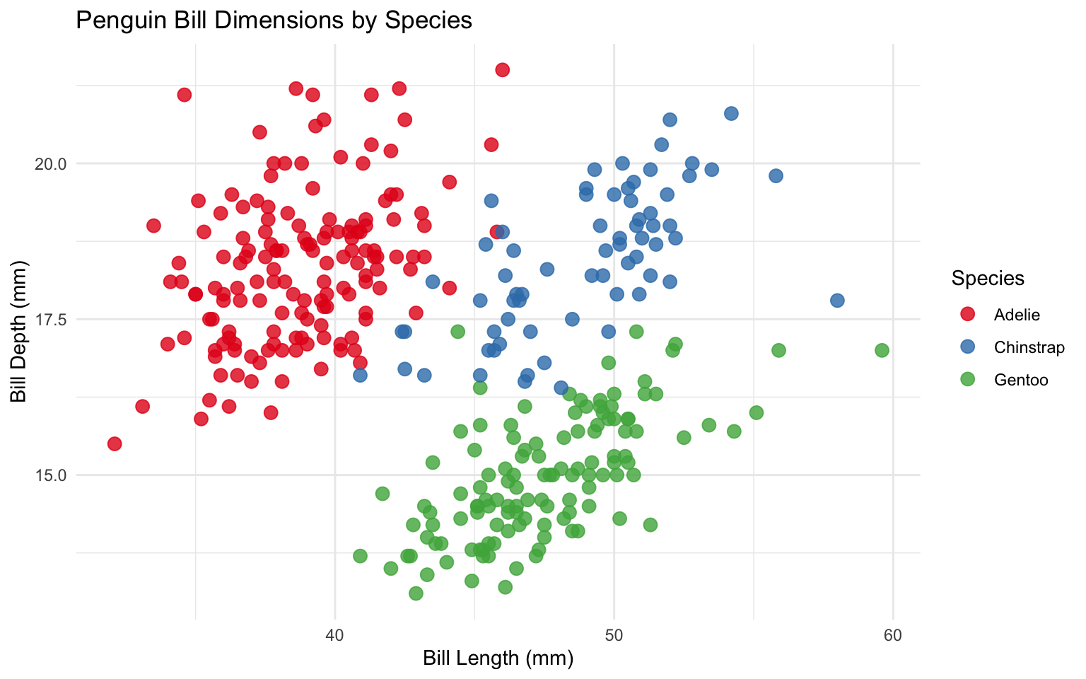
# Customize axis scales
ggplot(data = economics, aes(x = date, y = unemploy / 1000)) +
  geom_line(color = "steelblue", size = 1) +
  labs(
    title = "US Unemployment",
    subtitle = "1967-2015",
    x = NULL,
    y = "Unemployment (millions)"
  ) +
  scale_x_date(date_breaks = "5 years", date_labels = "%Y") +
  scale_y_continuous(labels = comma) +
  theme_minimal()
Themes
Themes control the overall appearance of the plot:
# Default theme
p <- ggplot(data = mpg, aes(x = displ, y = hwy, color = class)) +
  geom_point() +
  labs(
    title = "Fuel Efficiency vs. Engine Displacement",
    x = "Engine Displacement (L)",
    y = "Highway MPG",
    color = "Vehicle Class"
  )

p + theme_gray() + labs(subtitle = "theme_gray() - Default")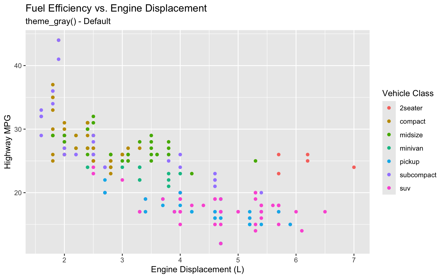
# Minimal theme
p + theme_minimal() + labs(subtitle = "theme_minimal()")
# Classic theme
p + theme_classic() + labs(subtitle = "theme_classic()")
# Light theme
p + theme_light() + labs(subtitle = "theme_light()")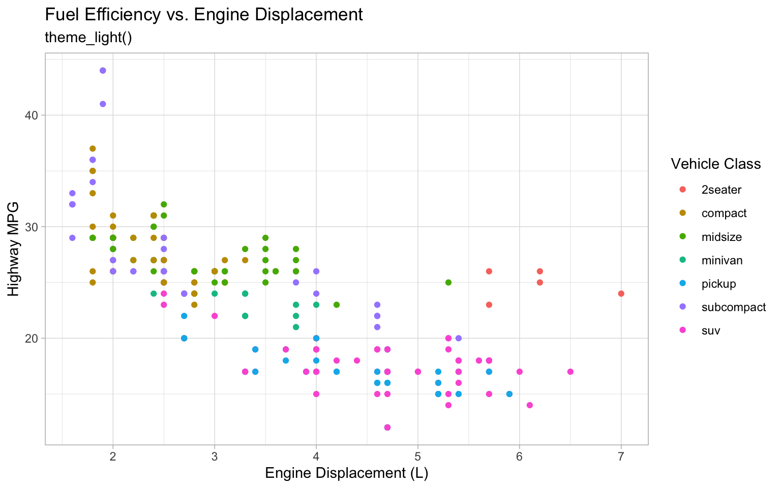
# Dark theme
p + theme_dark() + labs(subtitle = "theme_dark()")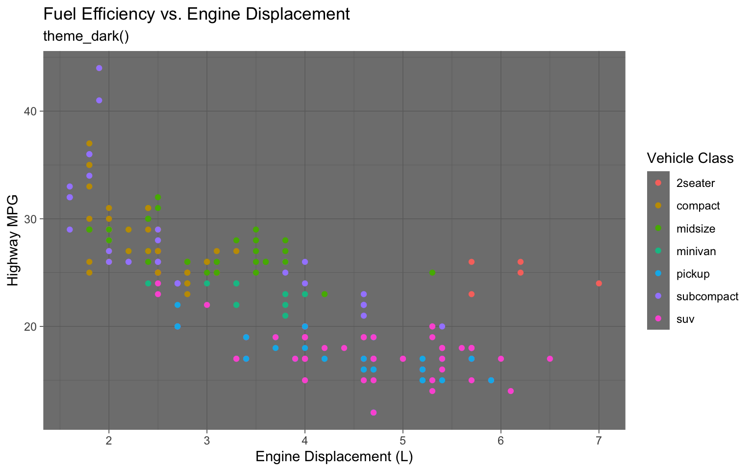
# Black and white theme
p + theme_bw() + labs(subtitle = "theme_bw()")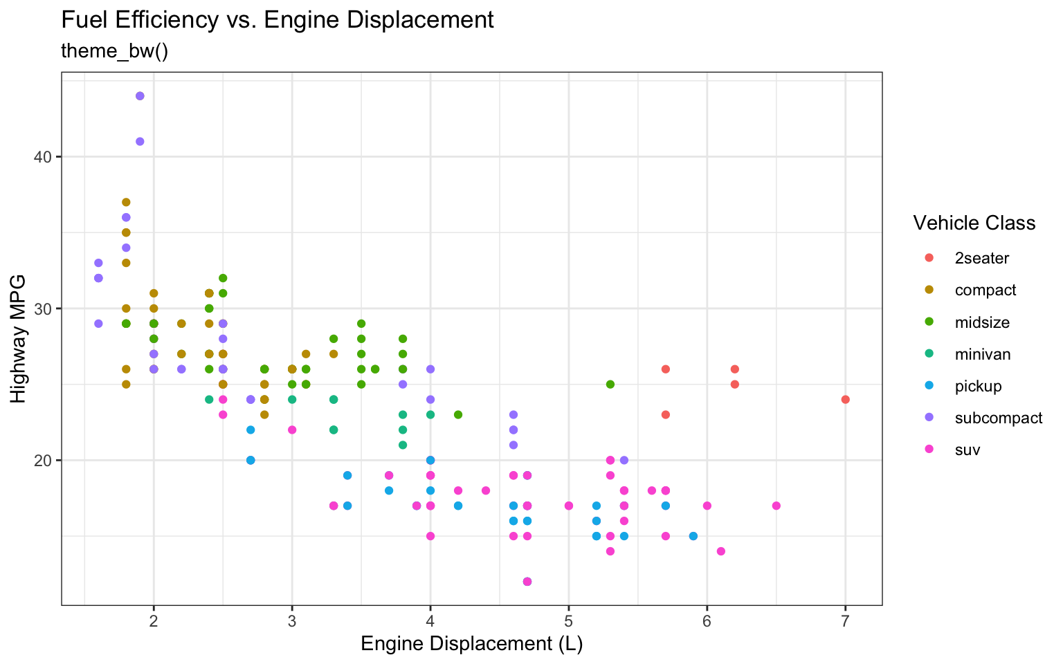
# The Economist theme (from ggthemes)
p + theme_economist() + labs(subtitle = "theme_economist()")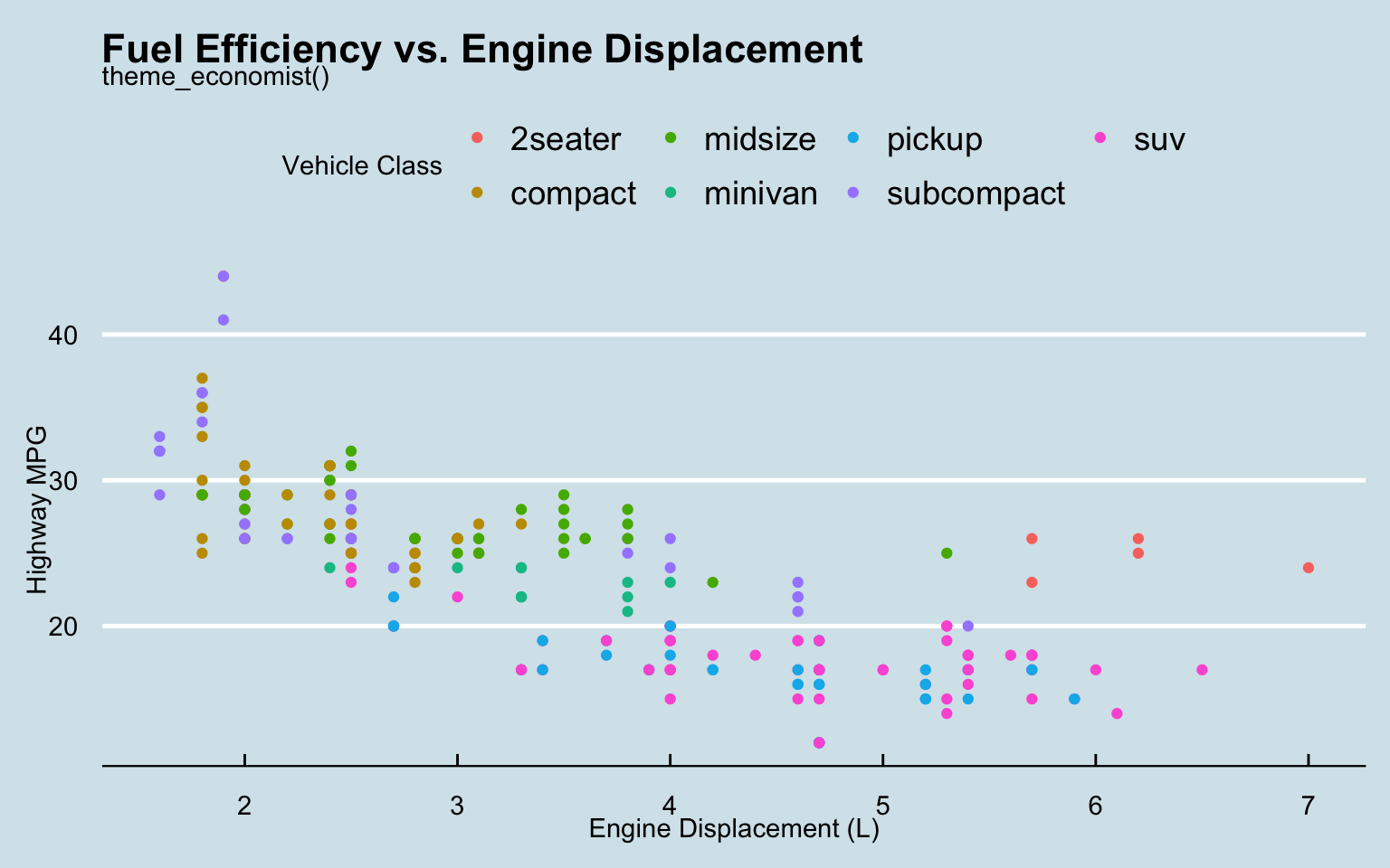
# The Wall Street Journal theme (from ggthemes)
p + theme_wsj() + labs(subtitle = "theme_wsj()")
Custom Themes
You can create your own custom theme:
# Create a custom theme
theme_business <- function() {
  theme_minimal() +
    theme(
      plot.title = element_text(face = "bold", size = 16),
      plot.subtitle = element_text(size = 12, color = "gray50"),
      plot.caption = element_text(size = 8, color = "gray50", hjust = 0),
      axis.title = element_text(face = "bold", size = 10),
      axis.text = element_text(size = 9),
      legend.title = element_text(face = "bold", size = 10),
      legend.text = element_text(size = 9),
      legend.position = "bottom",
      panel.grid.minor = element_blank(),
      panel.grid.major.x = element_blank()
    )
}

# Apply the custom theme
p + theme_business() + labs(subtitle = "Custom Business Theme")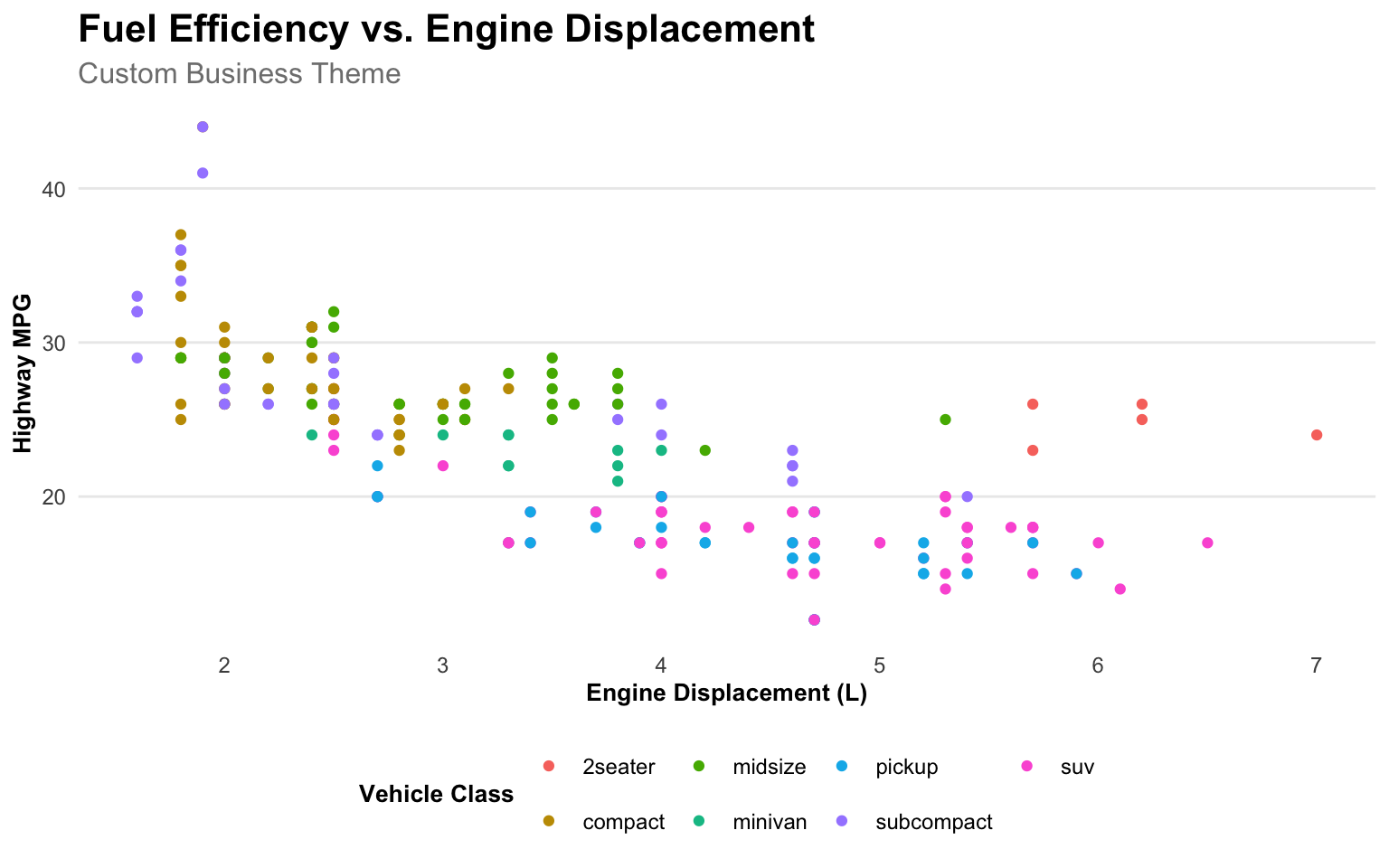
Annotations
Adding annotations to highlight important points:
# Create a plot with annotations
ggplot(data = economics, aes(x = date, y = unemploy / 1000)) +
  geom_line(color = "steelblue", size = 1) +
  geom_vline(xintercept = as.Date("2008-09-15"), linetype = "dashed", color = "red") +
  annotate(
    "text",
    x = as.Date("2008-09-15"),
    y = 12,
    label = "Financial Crisis",
    hjust = -0.1,
    color = "red"
  ) +
  geom_vline(xintercept = as.Date("2001-03-01"), linetype = "dashed", color = "darkgreen") +
  annotate(
    "text",
    x = as.Date("2001-03-01"),
    y = 7,
    label = "Dot-com Bubble",
    hjust = -0.1,
    color = "darkgreen"
  ) +
  labs(
    title = "US Unemployment",
    subtitle = "1967-2015, with key events highlighted",
    x = NULL,
    y = "Unemployment (millions)"
  ) +
  scale_x_date(date_breaks = "5 years", date_labels = "%Y") +
  scale_y_continuous(labels = comma) +
  theme_minimal()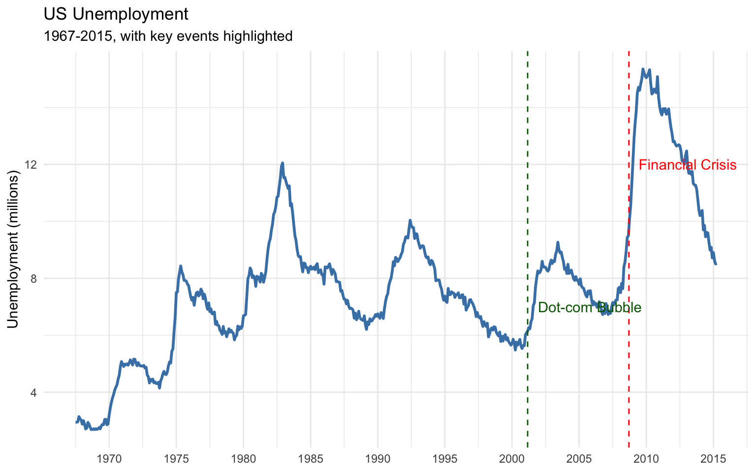
Combining Plots
The patchwork package makes it easy to combine multiple plots:
# Create individual plots
p1 <- ggplot(data = penguins, aes(x = species, y = body_mass_g, fill = species)) +
  geom_boxplot() +
  labs(
    title = "Body Mass by Species",
    x = NULL,
    y = "Body Mass (g)"
  ) +
  theme_minimal() +
  theme(legend.position = "none")

p2 <- ggplot(data = penguins, aes(x = species, y = flipper_length_mm, fill = species)) +
  geom_boxplot() +
  labs(
    title = "Flipper Length by Species",
    x = NULL,
    y = "Flipper Length (mm)"
  ) +
  theme_minimal() +
  theme(legend.position = "none")

p3 <- ggplot(data = penguins, aes(x = body_mass_g, y = flipper_length_mm, color = species)) +
  geom_point() +
  labs(
    title = "Body Mass vs. Flipper Length",
    x = "Body Mass (g)",
    y = "Flipper Length (mm)"
  ) +
  theme_minimal()

# Combine plots with patchwork
(p1 + p2) / p3 +
  plot_annotation(
    title = "Penguin Morphology",
    subtitle = "Comparing body mass and flipper length across species",
    caption = "Data source: Palmer Penguins package"
  ) &
  theme(
    plot.title = element_text(size = 16, face = "bold"),
    plot.subtitle = element_text(size = 12)
  )
Warning: Removed 2 rows containing non-finite outside the scale range
(`stat_boxplot()`).
Removed 2 rows containing non-finite outside the scale range
(`stat_boxplot()`).Warning: Removed 2 rows containing missing values or values outside the scale range
(`geom_point()`).
2.7 Interactive Visualizations
While static visualizations are useful for reports, interactive visualizations can be more engaging for dashboards and presentations. The plotly package allows you to create interactive versions of ggplot2 visualizations:
# Convert a ggplot to an interactive plotly plot
library(plotly)

p <- ggplot(data = penguins, aes(x = bill_length_mm, y = bill_depth_mm, color = species)) +
  geom_point(size = 3, alpha = 0.8) +
  labs(
    title = "Penguin Bill Dimensions by Species",
    x = "Bill Length (mm)",
    y = "Bill Depth (mm)",
    color = "Species"
  ) +
  theme_minimal()

ggplotly(p)
2.8 Statistical Summaries with modelsummary
The modelsummary package provides tools for creating publication-quality tables of descriptive statistics and model results.
Descriptive Statistics
# # Create a table of descriptive statistics
# datasummary_skim(penguins, type = "numeric")
#
# # Customize the table
# datasummary_skim(
#   penguins,
#   type = "numeric",
#   histogram = TRUE,
#   title = "Descriptive Statistics for Penguin Measurements"
# )
#
# # Group by a categorical variable
# datasummary_skim(
#   penguins,
#   type = "numeric",
#   by = "species",
#   title = "Descriptive Statistics by Penguin Species"
# )
Cross-Tabulations
# Create a cross-tabulation
# datasummary_crosstab(species ~ island, data = penguins)
#
# # Add row and column percentages
# datasummary_crosstab(species ~ island, data = penguins, statistic = c("cell", "row", "col"))
Model Summaries
# Fit some models
model1 <- lm(body_mass_g ~ bill_length_mm, data = penguins)
model2 <- lm(body_mass_g ~ bill_length_mm + bill_depth_mm, data = penguins)
model3 <- lm(body_mass_g ~ bill_length_mm + bill_depth_mm + flipper_length_mm, data = penguins)
model4 <- lm(body_mass_g ~ bill_length_mm + bill_depth_mm + flipper_length_mm + species, data = penguins)

# Create a model summary table
modelsummary(
  list(model1, model2, model3, model4),
  title = "Regression Models for Penguin Body Mass",
  stars = TRUE,
  gof_map = c("nobs", "r.squared", "adj.r.squared")
)| (1) | (2) | (3) | (4) | |
|---|---|---|---|---|
| + p < 0.1, * p < 0.05, ** p < 0.01, *** p < 0.001 | ||||
| (Intercept) | 362.307 | 3343.136*** | -6424.765*** | -4327.327*** |
| (283.345) | (429.912) | (561.469) | (494.866) | |
| bill_length_mm | 87.415*** | 75.281*** | 4.162 | 41.468*** |
| (6.402) | (5.971) | (5.329) | (7.163) | |
| bill_depth_mm | -142.723*** | 20.050 | 140.328*** | |
| (16.507) | (13.694) | (18.976) | ||
| flipper_length_mm | 50.269*** | 20.241*** | ||
| (2.477) | (3.105) | |||
| speciesChinstrap | -513.247*** | |||
| (82.140) | ||||
| speciesGentoo | 934.887*** | |||
| (140.778) | ||||
| Num.Obs. | 342 | 342 | 342 | 342 |
| R2 | 0.354 | 0.471 | 0.761 | 0.847 |
| R2 Adj. | 0.352 | 0.468 | 0.759 | 0.845 |
Customizing Tables
# Customize the model summary table
modelsummary(
  list(
    "Model 1" = model1,
    "Model 2" = model2,
    "Model 3" = model3,
    "Model 4" = model4
  ),
  title = "Regression Models for Penguin Body Mass",
  stars = TRUE,
  gof_map = c("nobs", "r.squared", "adj.r.squared"),
  coef_map = c(
    "bill_length_mm" = "Bill Length (mm)",
    "bill_depth_mm" = "Bill Depth (mm)",
    "flipper_length_mm" = "Flipper Length (mm)",
    "speciesChinstrap" = "Species: Chinstrap",
    "speciesGentoo" = "Species: Gentoo",
    "(Intercept)" = "Intercept"
  ),
  notes = "Data source: Palmer Penguins package"
)| Model 1 | Model 2 | Model 3 | Model 4 | |
|---|---|---|---|---|
| + p < 0.1, * p < 0.05, ** p < 0.01, *** p < 0.001 | ||||
| Data source: Palmer Penguins package | ||||
| Bill Length (mm) | 87.415*** | 75.281*** | 4.162 | 41.468*** |
| (6.402) | (5.971) | (5.329) | (7.163) | |
| Bill Depth (mm) | -142.723*** | 20.050 | 140.328*** | |
| (16.507) | (13.694) | (18.976) | ||
| Flipper Length (mm) | 50.269*** | 20.241*** | ||
| (2.477) | (3.105) | |||
| Species: Chinstrap | -513.247*** | |||
| (82.140) | ||||
| Species: Gentoo | 934.887*** | |||
| (140.778) | ||||
| Intercept | 362.307 | 3343.136*** | -6424.765*** | -4327.327*** |
| (283.345) | (429.912) | (561.469) | (494.866) | |
| Num.Obs. | 342 | 342 | 342 | 342 |
| R2 | 0.354 | 0.471 | 0.761 | 0.847 |
| R2 Adj. | 0.352 | 0.468 | 0.759 | 0.845 |
2.9 Business Case Study: Sales Dashboard
Let’s apply what we’ve learned to create a sales dashboard for a business.
The Scenario
You’re a data analyst at a retail company. You’ve been asked to create a dashboard that provides insights into sales performance across different product categories, regions, and time periods.
The Data
# Create a sample sales dataset
set.seed(123)  # For reproducibility

# Generate dates for the past year
dates <- seq.Date(from = as.Date("2022-01-01"), to = as.Date("2022-12-31"), by = "day")

# Generate product categories and regions
categories <- c("Electronics", "Clothing", "Home", "Beauty", "Sports")
regions <- c("North", "South", "East", "West", "Central")

# Generate sales data
n_sales <- 1000
sales_data <- tibble(
  date = sample(dates, n_sales, replace = TRUE),
  category = sample(categories, n_sales, replace = TRUE, prob = c(0.3, 0.25, 0.2, 0.15, 0.1)),
  region = sample(regions, n_sales, replace = TRUE),
  sales = rlnorm(n_sales, meanlog = 5, sdlog = 0.5),
  units = rpois(n_sales, lambda = 3),
  profit_margin = runif(n_sales, min = 0.1, max = 0.4)
) %>%
  mutate(
    profit = sales * profit_margin,
    month = month(date, label = TRUE),
    quarter = quarter(date),
    year = year(date)
  )

# View the data
head(sales_data)
# A tibble: 6 × 10
date category region sales units profit_margin profit month quarter
<date> <chr> <chr> <dbl> <int> <dbl> <dbl> <ord> <int>
1 2022-06-28 Beauty South 240. 2 0.277 66.7 Jun 2
2 2022-01-14 Home South 229. 2 0.124 28.4 Jan 1
3 2022-07-14 Clothing West 86.7 3 0.354 30.6 Jul 3
4 2022-11-02 Sports North 44.8 1 0.109 4.88 Nov 4
5 2022-04-28 Clothing North 374. 4 0.344 129. Apr 2
6 2022-10-26 Electronics West 433. 2 0.217 94.1 Oct 4
# ℹ 1 more variable: year <dbl>Sales by Category
# Total sales by category
category_sales <- sales_data %>%
  group_by(category) %>%
  summarize(
    total_sales = sum(sales),
    total_units = sum(units),
    total_profit = sum(profit),
    avg_profit_margin = mean(profit_margin),
    .groups = "drop"
  ) %>%
  arrange(desc(total_sales))

# Create a bar chart
p1 <- ggplot(data = category_sales, aes(x = reorder(category, total_sales), y = total_sales)) +
  geom_col(fill = "steelblue") +
  geom_text(aes(label = dollar(total_sales, accuracy = 1)), hjust = -0.1) +
  coord_flip() +
  labs(
    title = "Total Sales by Category",
    x = NULL,
    y = "Total Sales ($)"
  ) +
  scale_y_continuous(labels = dollar, expand = expansion(mult = c(0, 0.15))) +
  theme_minimal() +
  theme(
    panel.grid.major.y = element_blank(),
    panel.grid.minor = element_blank()
  )

p1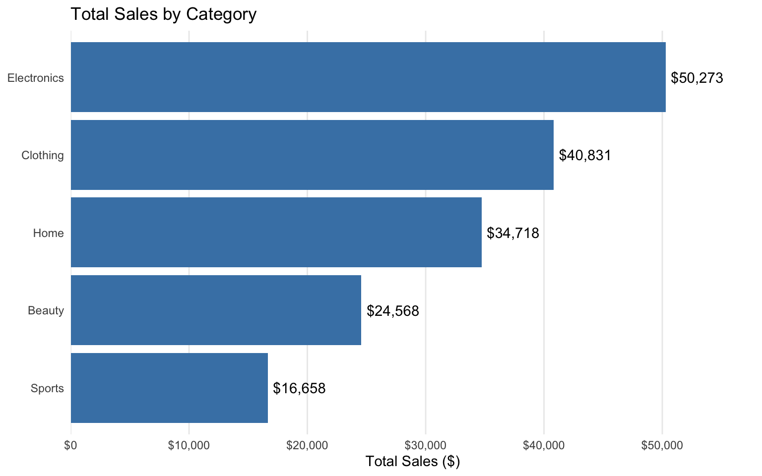
Sales by Region
# Total sales by region
region_sales <- sales_data %>%
  group_by(region) %>%
  summarize(
    total_sales = sum(sales),
    total_units = sum(units),
    total_profit = sum(profit),
    avg_profit_margin = mean(profit_margin),
    .groups = "drop"
  ) %>%
  arrange(desc(total_sales))

# Create a bar chart
p2 <- ggplot(data = region_sales, aes(x = reorder(region, total_sales), y = total_sales)) +
  geom_col(fill = "darkgreen") +
  geom_text(aes(label = dollar(total_sales, accuracy = 1)), hjust = -0.1) +
  coord_flip() +
  labs(
    title = "Total Sales by Region",
    x = NULL,
    y = "Total Sales ($)"
  ) +
  scale_y_continuous(labels = dollar, expand = expansion(mult = c(0, 0.15))) +
  theme_minimal() +
  theme(
    panel.grid.major.y = element_blank(),
    panel.grid.minor = element_blank()
  )

p2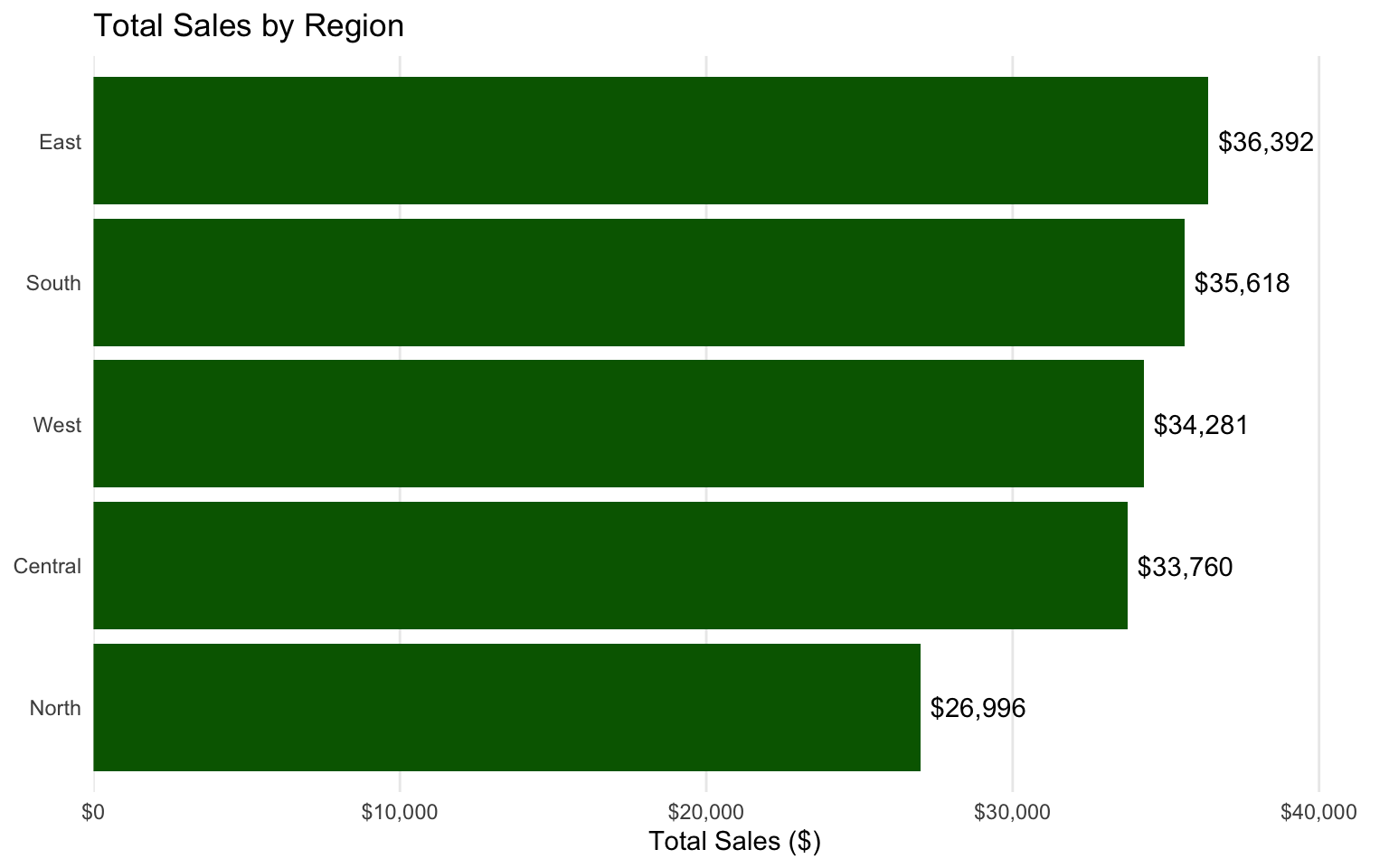
Sales Over Time
# Monthly sales
monthly_sales <- sales_data %>%
  group_by(month) %>%
  summarize(
    total_sales = sum(sales),
    total_units = sum(units),
    total_profit = sum(profit),
    .groups = "drop"
  )

# Create a line chart
p3 <- ggplot(data = monthly_sales, aes(x = month, y = total_sales, group = 1)) +
  geom_line(color = "darkblue", size = 1) +
  geom_point(color = "darkblue", size = 3) +
  labs(
    title = "Monthly Sales",
    x = NULL,
    y = "Total Sales ($)"
  ) +
  scale_y_continuous(labels = dollar) +
  theme_minimal()

p3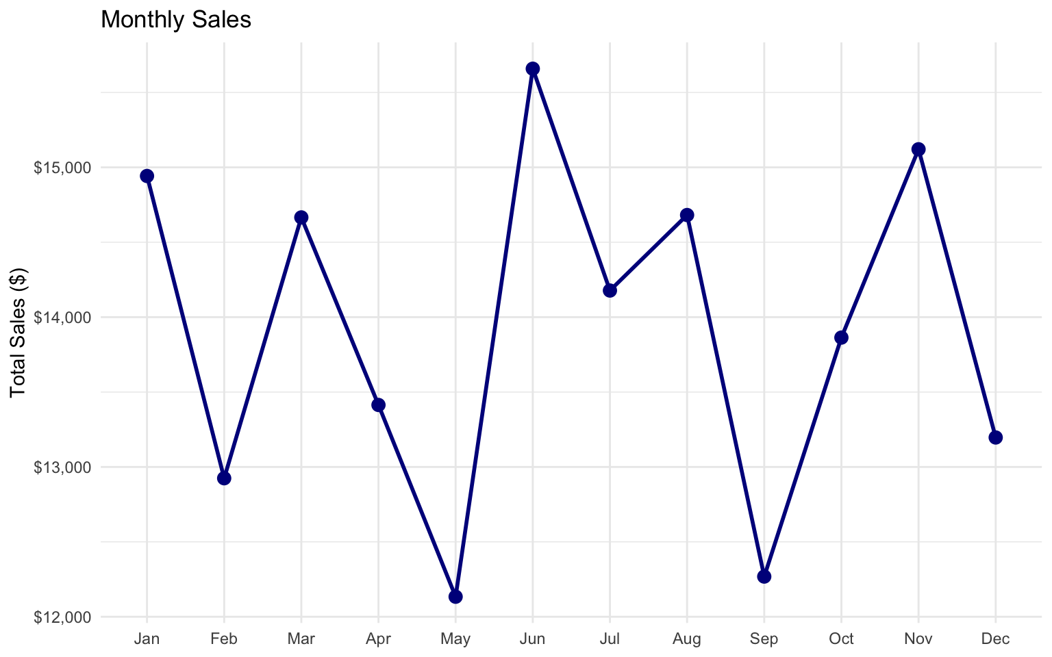
Category Performance by Region
# Sales by category and region
category_region_sales <- sales_data %>%
  group_by(category, region) %>%
  summarize(
    total_sales = sum(sales),
    total_units = sum(units),
    total_profit = sum(profit),
    .groups = "drop"
  )

# Create a heatmap
p4 <- ggplot(data = category_region_sales, aes(x = region, y = category, fill = total_sales)) +
  geom_tile() +
  geom_text(aes(label = dollar(total_sales, accuracy = 1)), color = "white", size = 3) +
  labs(
    title = "Sales by Category and Region",
    x = NULL,
    y = NULL,
    fill = "Total Sales"
  ) +
  scale_fill_gradient(low = "lightblue", high = "darkblue", labels = dollar) +
  theme_minimal()

p4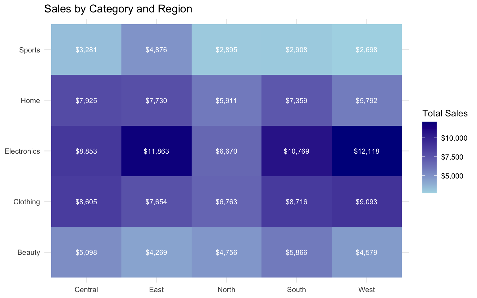
Profit Margins
# Profit margins by category
profit_margins <- sales_data %>%
  group_by(category) %>%
  summarize(
    total_sales = sum(sales),
    total_profit = sum(profit),
    profit_margin = total_profit / total_sales,
    .groups = "drop"
  ) %>%
  arrange(desc(profit_margin))

# Create a bar chart
p5 <- ggplot(data = profit_margins, aes(x = reorder(category, profit_margin), y = profit_margin)) +
  geom_col(fill = "purple") +
  geom_text(aes(label = percent(profit_margin, accuracy = 0.1)), hjust = -0.1) +
  coord_flip() +
  labs(
    title = "Profit Margin by Category",
    x = NULL,
    y = "Profit Margin"
  ) +
  scale_y_continuous(labels = percent, expand = expansion(mult = c(0, 0.15))) +
  theme_minimal() +
  theme(
    panel.grid.major.y = element_blank(),
    panel.grid.minor = element_blank()
  )

p5
Combining the Dashboard
# Combine the plots into a dashboard
(p1 + p2) / (p3 + p4) / p5 +
  plot_annotation(
    title = "Sales Performance Dashboard",
    subtitle = "2022 Sales Data",
    caption = "Data source: Simulated retail sales data"
  ) &
  theme(
    plot.title = element_text(size = 18, face = "bold"),
    plot.subtitle = element_text(size = 14)
  )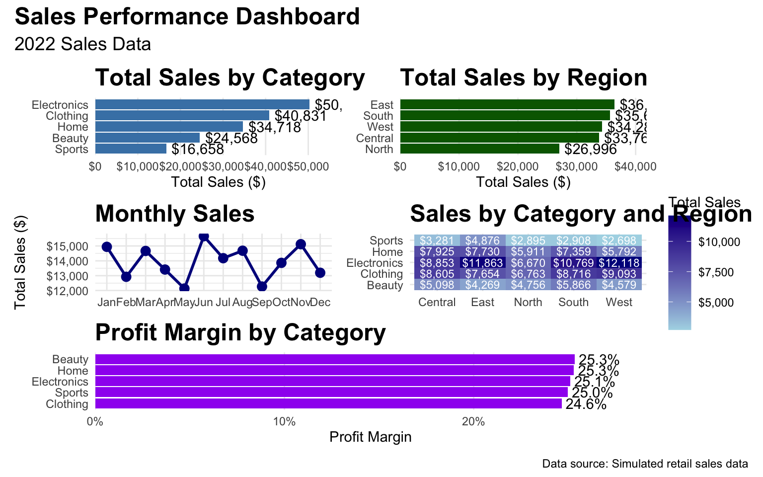
Key Insights
Based on our dashboard, we can provide the following insights:
- Category Performance: Electronics is the top-performing category in terms of total sales, followed by Clothing and Home.
- Regional Performance: The East region has the highest sales, followed by the West and North regions.
- Seasonal Trends: Sales peak in December, with a smaller peak in July, suggesting holiday and mid-year sale effects.
- Category-Region Analysis: Electronics performs particularly well in the East and West regions, while Clothing has strong performance across all regions.
- Profit Margins: Beauty products have the highest profit margin, followed by Sports and Home products, despite lower total sales.
Recommendations
- Inventory Management: Ensure adequate stock of Electronics and Clothing products, especially in the East and West regions.
- Seasonal Planning: Plan promotions and inventory around the December and July peaks.
- Regional Focus: Investigate why the Central region has lower sales and develop strategies to improve performance.
- Product Mix: Consider expanding the Beauty and Sports categories, which have high profit margins.
- Pricing Strategy: Review pricing for Electronics, which has the lowest profit margin despite high sales.
2.10 Exercises
Exercise 1: Data Visualization
Using the gapminder dataset:
- Create a scatter plot of GDP per capita vs. life expectancy for the year 2007.
- Color the points by continent and size them by population.
- Add appropriate titles, labels, and a theme.
- Create a version of the plot with a logarithmic scale for GDP per capita.
Exercise 2: Time Series Visualization
Using the economics dataset:
- Create a line chart showing the unemployment rate over time.
- Add a trend line using a smoothing function.
- Highlight periods of recession with shaded rectangles or vertical lines.
- Add annotations for key economic events.
Exercise 3: Statistical Summaries
Using the mtcars dataset:
- Create a table of descriptive statistics for the numeric variables.
- Group the statistics by the number of cylinders (
cyl). - Fit a linear regression model predicting
mpgfromhp,wt, andcyl. - Create a publication-quality table of the regression results.
Exercise 4: Dashboard Creation
Create a dashboard for a business scenario of your choice:
- Generate or find a suitable dataset.
- Create at least three different visualizations that provide insights into the data.
- Combine the visualizations into a dashboard using patchwork.
- Add appropriate titles, labels, and annotations.
- Provide business insights and recommendations based on the dashboard.
2.11 Summary
In this chapter, we’ve covered the fundamentals of statistical computing and data visualization in R. We’ve learned how to:
- Create various types of plots using ggplot2
- Customize and enhance visualizations for business presentations
- Generate statistical summaries using modelsummary
- Create publication-quality tables for reports
- Combine visualizations into dashboards
- Apply best practices for data visualization in business contexts
These skills are essential for communicating data insights effectively to stakeholders and making data-driven business decisions. By mastering these techniques, you’ll be able to create compelling visualizations and reports that drive action and add value to your organization.
2.12 References
- Wickham, H. (2016). ggplot2: Elegant Graphics for Data Analysis. Springer. https://ggplot2-book.org/
- Wilke, C. O. (2019). Fundamentals of Data Visualization. O’Reilly Media. https://clauswilke.com/dataviz/
- Healy, K. (2018). Data Visualization: A Practical Introduction. Princeton University Press. https://socviz.co/
- Arel-Bundock, V. (2022). modelsummary: Data and Model Summaries in R. https://vincentarelbundock.github.io/modelsummary/